

New arrival: Just joined the company, and this task was one of my initial onboarding assignments.
Stable e-commerce: Eneba Marketplace had implemented various global payment methods (several native options in each country) through multiple PSPs (Payment Service Providers).
Improvement: Eneba was actively looking for improvement areas, particularly in the payment stage - a critical aspect of any ecommerce operation.
Investigate friction points utilize available tools to conduct a comprehensive audit focusing on desktop experience.
Prepare a report with suggested updates, outlining the diagnosed problems and recommended solutions. This could include low-fidelity attachments where feasible and reasonable.
Backlog update: Create backlog of initiatives for the newly formed dedicated team, which I was to be a part of.
I started my research by collecting and analyzing quantitative data. After gaining access to the available analytics tools, I examined key metrics to uncover initial insights. I focused on:
Google Analytics
Mobile vs. desktop performance
Customer segments (demographics and purchasing behavior)
Page visits & time spent in checkout
Funnel & conversion rates, drop-offs
Overview of payment method usage by region
Hotjar
Recordings & Heatmaps - how users interact with checkout.
NPS History
Past Surveys - analyzed the results of all past surveys
Conclusions
⚠️ High drop-off rate after a purchase decision in the cart
⚠️ URL & event tracking issues - the checkout process was embedded under a single URL, preventing proper funnel tracking in Google Analytics.
⚠️ NPS misconfiguration – a single, global NPS survey was used, making it impossible to analyze regional differences
💡Net Promoter Score: 64~ remained over time
Execution
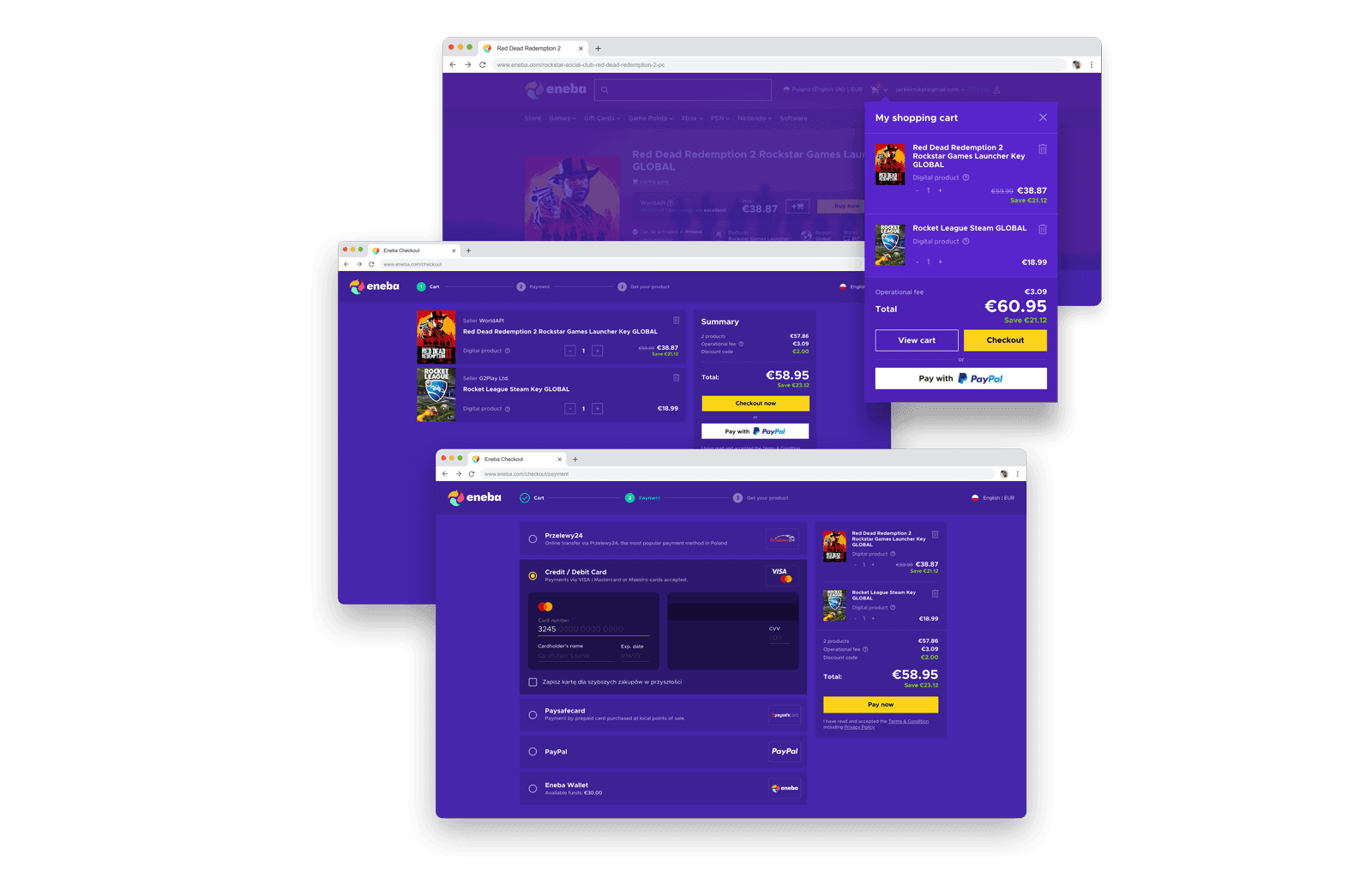
I continued my research with a personal experience check. As a gamer, stepping into the user role was quite straightforward as I regularly make gaming-related purchases.
Scenarios: I created 3 real-world scenarios for myself, involving different types of products I would want to buy:
Gift Card: To top-up my Steam account
Pre-order: Video game before the release.
Favorite game + DLC (Downloadable Content)
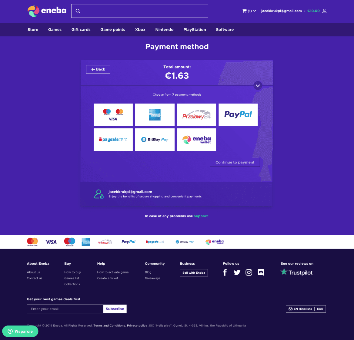
Payment methods: I completed all 3 purchases, using the two most popular global payment methods (Credit Card and PayPal), plus my favorite one, common in my region - Poland (Online bank transfer via Przelewy24).
User journey map: During the process, I documented my interaction with screenshots and noted down my experiences and feelings using an user journey map. Additionally, I used screen recording to ensure I didn't miss any steps and to be able to replay the purchase process.
Conclusions
Overall, I identified several friction points, including the one that I personally perceive as critical ⚠️ In the next steps, my aim was to concentrate on these significant points and seek confirmation for the hypotheses I initially formed.
Planning
Respondents: Given the limited time and lack of funds for compensating respondents, I recruited 5 individuals fitting the target group from among my social media contacts. Within the next days, I scheduled 30-minute testing sessions with each of them.
Method: Moderated remote usability tests using LIVE environment. The participant would share their screen during an online call, allowing me to observe how they interacted with the checkout.
Execution
Scenario: The scenario was split into two parts: the first involved the search for a product they wished to buy, and the second focused on the purchasing process. I ensured that product searching did not exceed 20% of the allotted time, with the remaining 80% devoted to examining the shopping cart and payment aspects.
Endpoint: The scenario always ended before the final transaction approval and the triggering payment gateway. The process of receiving the product was not included.
Moderation challenges: Given the sensitive nature of the process, involving payments, I had to continuously monitor and confirm the safety of each interaction with the checkout to assure the participant that a transaction would not be initiated, alleviating fears they might accidentally purchase something.
Conclusions
Overall, I was able to validate my hypotheses about existing friction points while also discovering a few minor issues. Importantly, I initially confirmed a critical technical issue related to URLs and navigation in the checkout.
⚠️ Respondents experienced ejection when using the browser's Back button, causing the entire process to restart.
⚠️ Respondents were confused about how the "Total price" was updated.
⚠️ Respondents were distracted by the main navigation, which included the product catalog.
My aim was to generally analyze the common cases where users experienced problems along the purchase path. At this stage I focused on:
FAQ & Support page - reviewed related topics described on the Support page
Consultation with Customer Support Team Leader - discussed the most common topics reported by users.
Conclusions
No significant insights emerged, as most reported issues in Customer Support were related to post-purchase experiences (Return requests, Product doesn't work, etc.)
I did not perform an in-depth analysis - my primary aim was to seek confirmations for the hypotheses I had initially formulated.
After completing the research phases, I began compiling and structuring the final report. It included detailed descriptions of the 17 identified issues with an initial prioritization 1 Critical, 3 High, 3 Medium, 10 Low. Each framed as a research hypothesis, accompanied by relevant recommendations, and usability heuristics.
In addition to the main report, I attached:
Concept drafts – An Adobe XD file containing visualizations of low-fidelity concepts to help stakeholders better understand the context and proposed ideas.
Out-of-scope recommendations – Extra, innovative ideas that emerged during the research, which could positively impact business or UX metrics (CR, Retention, NPS, CSAT, etc.) These included upselling/cross-selling suggestions and interface improvements.
To effectively communicate my findings, I recorded a 15-minute video presentation for stakeholders. In 9 slides, I briefly explained the key research results and presented initial low-fidelity improvement concepts.


A visualization of my work-in-progress file with low-fidelity concepts used for the presentation. I created a report in Google Docs to document all my findings.

Due to technical challenges and the decision to prioritize a full checkout redesign, only minimal time was allocated to quick updates. Some of these changes successfully validated hypotheses and had a measurable positive impact.
#
Project hypothesis
Implemented solution
Result / Impact
1
Operational fee.
Displaying extra information about payment service provider fee and reason price has been updated will decrease
Question mark icon with tooltip that explain the reason of updated price in checkout.
2
Footer content as distractor.
Hiding footer container in checkout process and removing potential distractors will decrease process abandonment rate.
Footer container removed from whole process (Starting from the Cart)
3
Expiration date feedback message.
Providing instantly appeared feedback message about wrongly provided format o expiration date will decrease amount of server-side errors and the same time increase process success rate.
Client-side validation on the input-field Credit Card Expiration Date added.
Key takeaways 💡
Price updates with context improve user trust – Users are more likely to continue the purchase even when the price is updated, as long as they understand the reason behind the change.
Reducing distractions increases conversion – Eliminating unnecessary links and distractions in the checkout process improves conversion rates and reduces the risk of misclicks.
Purchase intent remains strong despite minor errors – Users who have already made a purchase decision based on price are highly motivated to complete the transaction, even if they encounter form errors.
After analysis by the Dev Team, it became clear that fixing most of the identified issues required a frontend re-development. As a result, a complete checkout redesign was planned, with the report serving as the primary document outlining requirements.
Before starting the redesign process, we formulated the following hypotheses:
#
Problem (Observation)
Solution (Project hypothesis)
Requirements
Cart as part of the purchase process – The redesign included the cart interface, which became the first step of the checkout process.
Responsive design – Ensured a fully optimized interface for mobile devices.
Discount code support – Implemented the ability to apply discount codes seamlessly.
Technical Constraints
Frontend-only changes – The redesign was limited to frontend modifications, without interfering with backend logic. The scope was restricted to fixing identified issues rather than introducing major architectural changes.
No new functionalities – To avoid scope creep and delays, no new features were implemented. Instead, all ideas beyond the initial scope were added to the product backlog for future iterations.
Process Mapping
The first step was mapping the entire checkout process to identify all possible user flows and edge cases. I began with my own exploration, then iteratively refined the process map with developers and the PM responsible for payment gateway integrations.
The final process map clearly outlined almost full range of possible scenarios, and number of screens required redesigning including all exceptions and edge cases.
Checkout process map, which I used to outline all possible screen variations and edge cases occurring under specific conditions.

Competitor Analysis
I conducted a simple competitor analysis to identify common patterns and potential discrepancies. Given the specific nature of digital product marketplaces, I focused on direct competitors, including G2A.com, Kinguin, Gamivo, CD-KEYs, and InstantGaming.
Design Community Review
I explored Dribbble and Behance for inspiration, looking for easily implementable UX/UI improvements that could have a positive impact on key UX metrics or create a competitive advantage.
Conclusions
User flows across direct competitors are largely similar 💡 All marketplaces offer the same core payment options, with minor variations based on country-specific methods.
Some competitors introduce extra steps in checkout for up-selling (SaaS add-ons, additional protections) – While this can add friction, avoiding such interruptions could be an advantage for us.
Frequent issues in page architecture and URL handling ⚠️ Some competitors struggle with poor checkout URL structures, creating tracking and usability problems. Fixing this in our redesign could give us a competitive edge.
Two-column checkout layout appears to be the industry standard – Considering usability and familiarity, I decided to maintain this design pattern in our approach💡
Working from the office, I began designing the new checkout experience. Given the existing Design System, I immediately started with high-fidelity designs, working on both desktop and mobile versions in parallel. I iteratively prepared screen batches and presented them using interactive prototypes.
Validation & Collaboration - Validation during the design phase was limited and focused primarily on implementation. Feedback was gathered from:
PM – consulting on payment-related challenges
Developers - covering edge cases
Guerilla Testing – occasional informal sessions to validate specific micro-interactions and screens in checkout
Deliverables
Complete UI screens for the previously mapped checkout process, both desktop and mobile
Graphic assets library – Over 100 payment method and service provider icons
Constraints
Payment fees - we couldn't use the term "payment fee" for clarity, even though it was the most user-friendly naming option. We also couldn't display service fees varying by payment method, as this could imply a direct fee for making a payment (which is restricted by EU regulations)
Implementation of new "Get the key" page - Updating it would have significantly increase development time. The existing page remained unchanged, even though the update was communicated as part of the process.


A visualization of my work-in-progress file with low-fidelity concepts used for the presentation. I created a report in Google Docs to document all my findings.
During the development phase, I maintained continuous collaboration with developers, having direct access to the development environment. I provided real-time feedback to front-end developers and, in return, they reported issues with the designed elements. I responded by optimizing designs, adjusting UI elements and delivering missing assets.
Post-Release Testing - I conducted live environment testing:
Performed test purchases, identifying minor UI bugs related to UX writing, rendering issues, and layout inconsistencies.
Provided ongoing feedback and adjustments based on real-world interactions.
Analytics Implementation & Monitoring
Following the release, we implemented tracking analytics and focused on continuous monitoring of NPS to measure user satisfaction and further evaluate the impact of the redesign.
Slight reduction in drop-off rate (~10%) achieved through quick-fix updates implemented.
28% increased CR on mobile devices (from 2,49% to 3,19%) (Sep. 2019)
No adoption effect observed - The release had no negative impact on key metrics, as users adapted smoothly without disruptions.
Improved NPS analytics - A new system was implemented, allowing regional tracking for better insights into key markets (Europe, North America, LATAM, MENA, CIS, Asia).
The new checkout was successfully delivered and is still live on Eneba.com
Start with cognitive walkthrough - Looking at data before experiencing the product can change how you view things. Next time, I'll use this method first.
Private purchases & returns - Using private funds gave me valuable insights into the purchasing but also product return processes. As a new team member, these experiences added to my overall understanding of the product.
Value of moderated tests - Moderated tests provided valuable insights, reinforcing their importance in the process. This reminds me of how important it is to include user testing.
Video presentation of research output: The video format for presenting insights and recommendations proved highly effective - it allowed stakeholders to engage with the content on their own time, leading to a positive reception and broader sharing among team members. That approach highlighted the value of flexible communication.
Close collaboration with Devs – Working on-site with developers accelerated technical validation, helping to identify edge cases.
Common Design Patterns! – Using familiar design patterns was likely a key reason why there was no adoption effect and no negative impact on key metrics after the new checkout release.
Too Many Hypotheses – Formulating too many hypotheses made it difficult to pinpoint which specific solutions had the most significant impact on the final results.
Lack of secondary research – Reviewing industry articles, case studies, and other online resources could have provided a broader perspective on common e-commerce checkout friction points. This additional research might have enriched insights and supported a more data-driven approach.
No post-launch usability studies – Qualitative usability testing was not conducted after the new checkout was released in the live environment. As a result, only quantitative analytics data was available to confirm the outcome.
No A/B experimentation – There was no controlled A/B testing to compare the new checkout with the previous version. At the time, the company lacked the infrastructure to release and manage experiments, despite the potential positive impact of such an approach.
No cross/up selling features – These were considered out of scope for this phase of the project.


