


Overview
No mobile app: Eneba, global digital gaming marketplace, lacked a mobile application, leaving room for growth.
New Channel: The ambitious goal was to boost GMV by launching a mobile app.
High web traffic in the mobile environment suggests a mobile app could positively impact GMV
The low mobile conversion rate, compared to desktop, implies potential for mobile user conversion improvement.
Market Expansion: Eneba expanded from a B2C platform to a C2C marketplace with its 'Classifieds' feature, initially targeting 🇪🇸 Spain, 🇱🇹 Lithuania, 🇫🇷 France, and later expanding to 🇮🇹 Italy and 🇵🇹 Portugal.
User behavior hypothesis: Creating offers via a mobile app is the natural way for users to list their items. This insight supported the timing of the mobile app launch.
Define the scope of the Minimum Viable Product (MVP) for the app.
Design high-fidelity, ready-to-develop UI designs.
Create branding materials for app marketplaces.
Immediately after the kick-off meeting, our newly formed team established key ceremonies and defined our workflow to ensure smooth collaboration. The first step was organizing a workshop to determine the project scope.
Over the next few days, I worked closely with the PM and the Dev team in a series of workshops. Together, we defined the app requirements, identified existing and potential constraints, and we created structured project roadmap in Jira for progress tracking.
Requirements
🔒 Common back-end: Replicate web environment functionality without modifying logic.
🔒 ReactNative components: Reuse to maximum mobile-native components and design patterns easily applicable with ReactNative framework.
🔒 Development scope: We split native and web-view user journeys for efficiency.
Native: onboarding, product search & discovery, cart management, listing creation, basic-level app settings.
Web-View: checkout process, wallet features (top-up & withdraw), account details management, all other side user-journeys
🫵🏼 Log in with Apple ID: Provide platform-native login required by AppStore.
Restrictions
❌ Limited native development - Due to development effort we couldn't natively develop all screens and user journeys. It was essential to maximize the use of web-views, using the responsive web version displayed in-app.
❌ Simplified checkout - Due to current back-end limitations, it was impossible to buy more that one physical products in one transaction.
❌ Limited expansion of mobile native functionalities - At this stage the scope couldn't include mobile-native features such as push notifications due to the need for a separate back-end of notification system.
⛔️ Restricted Gift Cards - Due to Apple AppStore Terms & Conditions we could not present Top-up gift cards in marketplace for iOS customers.
This part of the research was divided into two areas: I installed and analyzed available competitors' apps then I reviewed content generated by users on app stores.
Competitors - I focused on several competitor apps that were either direct or indirect competition.
TOP Online marketplaces: Ebay, Amazon, Allegro 🇵🇱, Aliexpress
Gaming marketplaces: G2A, Kinguin, Gamivo
Classifieds: OLX, Wallapop 🇪🇸, Leboncoin 🇫🇷
Mobile Apps - Analysis of available features, their implementation and the type of chosen design patterns, focusing on:
information architecture and approach to main navigation
Red routes - purchasing and onboarding process
Product Pages - essential element in the user's decision-making process
The use of web-views
Google Play & AppStore reviews - Analysis of user-generated content in search of negative ratings and reviews
Common friction-points users complain about
Significant solutions that might be required (eg. receiving digital code)
Specific bugs/errors
Findings
Bottom navigation is a widely adopted mobile-native pattern across competitors.
Web-views are commonly used, not just by smaller players but also by major competitors, proving their effectiveness.
User complaints frequently mention issues with receiving purchased digital products.
Post-purchase customer service is a common pain point, especially regarding response times.
Bugs and technical issues are prevalent in competitor apps, particularly in product search and exploration.
As part of the design preparation, I revisited the dynamic and ever-changing ;) mobile design guidelines by reviewing the available online sources:
Human Interface Guidelines (iOS)
Material Design (Android)
React Native framework possibilities, limitations and use-cases
My aim was to gain insights regarding:
“The ideal” structure and content presentation
Native-mobile approaches to navigation and IA from a developer's perspective
Popular patterns for product discovery and purchasing process
How to conduct contextual menus and micro-processes
Key aspects of accessibility in mobile apps
Initial plan by scope - Together with the development team, we determined the sequence based on priority and development effort:
App core: Homepage and main information architecture and page system
❗️[Red route] Offer creation process
❗️[Red route] Product discovery and search
Cart management
Checkout and receiving digital products
User onboarding
My Account & additional user journeys
I leveraged it to start my work, creating low-fidelity wireframes for initial prototyping. Each round was usually broken down into 3 stages, each involving discussions with different team members:
PM: Scope validation - reviewed prototype functionalities to align with project goals.
Devs: Technical validation - reviewed used design patterns to verify their technical feasibility and compatibility with existing BE
Designers: Design Review - reviewed user flows and overall design for usability and to fit design principles.
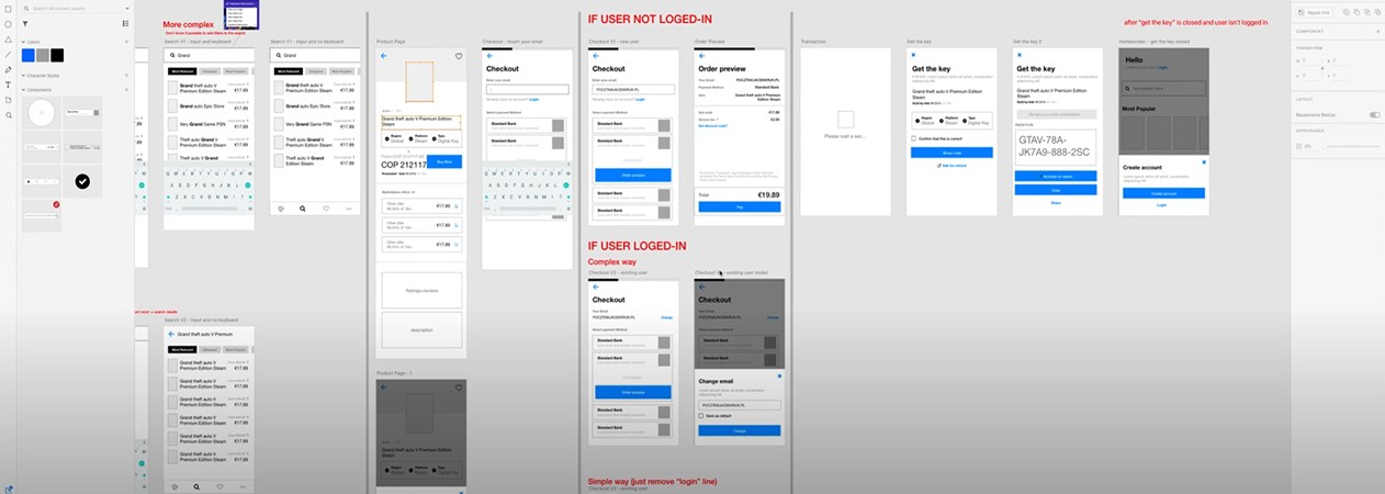

Preview of low-fidelity prototypes.
Process
Working simultaneously, I focused on multiple aspects of UI design to ensure a seamless and impactful user experience:
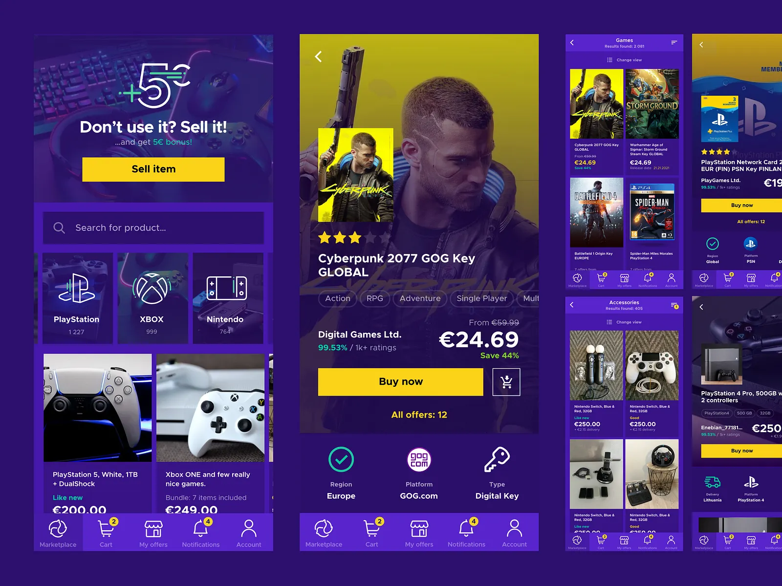
Prototype Updates - Enhanced prototypes for improved aesthetics, usability, and accessibility. These updates addressed user feedback and aligned with the overall design vision.
Design System Foundations - Established the foundations for a new, mobile app-specific design system. This effort created a scalable framework for consistent UI design, ensuring future development efficiency.
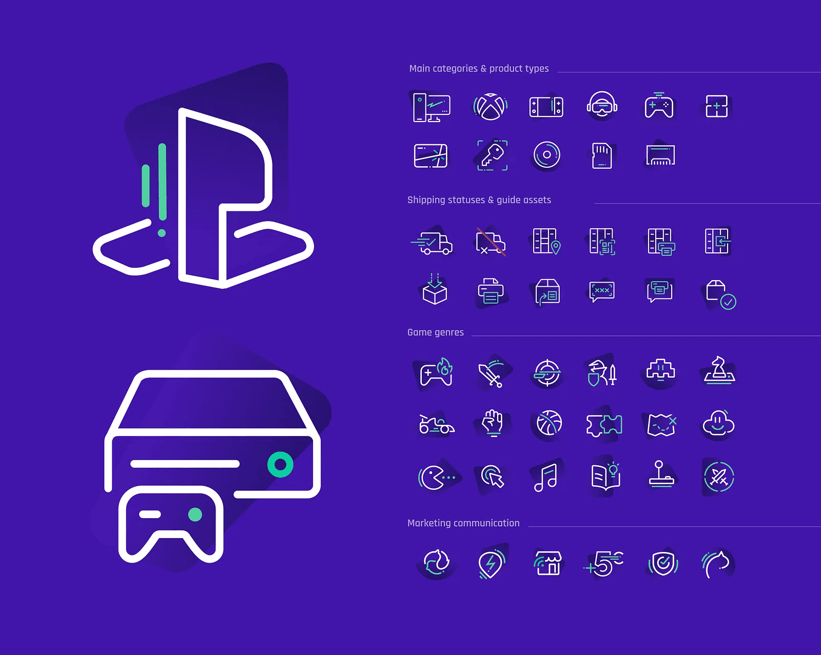
Visual Language Standardization - Developed a graphic assets library to solve inconsistencies across the ecosystem. This initiative standardized the visual language, laying the groundwork for the future mobile app's cohesive design.
Validation of UI Design
Developers - Conducted front-end validation sessions to gather feedback on potential development challenges and adjust designs accordingly.
Designers - Engaged in design critiques with a focus on visual and accessibility improvements, fostering a collaborative refinement process.
Guerrilla Tests - Because there wasn't time to plan and conduct usability tests during the design phase, I occasionally carried out quick, guerrilla-style tests on essential user journeys. These tests focused on single screens, such as the homepage, main navigation, or product details screens, to ensure usability and accessibility. This approach provided rapid, actionable insights for the most critical parts of the design.
Results
A clear and consistent visual identity for the mobile app.
Initial mobile app design system that streamlined collaboration with developers.
Positive feedback from stakeholders, highlighting improved usability and design cohesion.
Every time a new version was released for testing, I actively engaged in the Quality Assurance process, trying to catch any bugs in operation or issues with the app's responsiveness and usability in a real environment. The process included:
UI review - I examined every part of the app, first concentrating on visual details, UI quality, and interactions.
Cognitive walkthrough - As functionalities became complete, I conducted user journey tests to review important processes.
Pair coding sessions - I occasionally collaborated directly with devs to make small UI adjustments, working together on the front-end code.
Backlog update: For larger modifications needing more development work, I managed them using Jira Backlog.
Key Visual: In a time-efficient manner, I crafted a basic Key Visual for the installation campaign. This served as the foundation for designing the app's communication elements on Google Play and App Store.
Graphic Assets: I exported a series of graphic assets that showcased the app and its core features. These assets were made available for use in future marketing campaigns across various marketplace platforms and social media channels.


Key visual illustration for marketing launch campaign
MVP release: We launched the app just 3 months after we started designing it.
Mobile users' Conversion Rate increased by 129%, reaching 3.5% (Nov.2021), compared to 1.7% on mobile web and 1.36% on tablets (Jun.2021)
Avg. offer creation time was reduced by 30%, from ~4 minutes (mobile web) to ~3 minutes on the app (compared to ~6 minutes on desktop)
GMV increase: The Gross Merchandise Value from mobile devices increased within the first three months after launch.
Improved success rate in offer creation.
Users shift to mobile app: The app didn't attract many new users. However, within a month after launch, some amount of our previous desktop users decided to download the app and used it to create at least one offer.
Design system: We set up the initial design framework for the mobile app, making it ready for more work in the future.
#
Problem (Observation)
Solution (Project hypothesis)
Result
1
Desktop vs mobile traffic
Desktop vs mobile traffic comparison revealed high mobile web traffic, suggesting that a mobile app could positively impact overall business performance.
The introduction of a mobile app is expected to increase Gross Merchandise Value (GMV) from mobile users without negatively affecting desktop performance.
2
Logged out users
A significant portion of users (mobile and desktop) complete transactions without logging in, indicating potential for increasing new account sign-ups among mobile users.
Allowing all users to see key features but requiring login for full access will encourage mobile users to create accounts, despite the risk of added friction.
3
CR on mobile devices
The conversion rate (CR) on mobile devices is significantly lower than on desktop, indicating untapped potential to improve conversions for mobile users.
Launching a mobile app will improve the conversion rate (CR) and enhance user engagement, validating the need for mobile-native solutions.
4
Cart abandonment rate
Users often abandon the purchase process after adding items to the cart or triggering [Buy now] action.
Providing Mobile-friendly checkout interface in app will decrease cart abandonment rate.
5
Gift Cards sale
High sales of "Gift Cards" products via mobile devices indicate an opportunity to further boost this category.
Displaying easily accessible Gift Cards product on the mobile app home screen will increase sales in this category.
6
Low success rate of offer creation
Desktop users often abandon offer creation at the photo upload step.
Enabling mobile users to create offers with mobile-native features (smartphone camera, push/pull notifications) will increase the Offer Creation Success Rate.


Improved communication with Devs: More frequent calls and co-working sessions directly with the developers improved app development workflow.
Back-end is essential: It might seem obvious, but it wasn't for me at first ;) It's impossible to develop an app without additional back-end work, even when we maximally re-use existing procedures or user flows.
React Native limitations: The React Native framework still has some limitations which sometimes hinder the use of mobile-native design patterns recommended by Google and Apple.
Limited time for direct validation with end-users – There was not enough time for in-depth usability testing during the design phase, limiting early-stage user feedback.
Post-launch research constraints – After launch, the company shifted focus, placing the app in maintenance mode as part of a broader strategic move. With the transition to cross-functional teams, each designer took ownership of specific areas, making immediate post-release usability studies challenging.


