


I've been leading design process of Pergato mobile app MVP for last 6 months.
Pergato app was close to first public release as a PoC, targeting dog and cat owners focused on their pets' wellbeing.
Trademark registration was required early to establish business entities in the USA and Europe.
A local event in Bronxville/US, started being organized to build brand awareness and acquire early users.
A Brand book need's to be created to define the visual identity and rules for branding usage for external collaborators when working on digital and print assets.
Create a logo concept, including naming.
Design and export a logo ready for digital (web and mobile) and physical use.
Deliver a basic-level brandbook with:
Guidelines for tone of voice and visual language.
Requirements and recommendations for print materials.
Instructions for marketing and external contractors producing branded materials.
Kick-off session
Defined the branding vision, app concept, and high-level requirements.
Discussed naming ideas, with the sponsor suggesting "Pergato" as a potential name while exploring alternatives.
Naming process
Generated over 50 unique name ideas using ChatGPT and prompt engineering, refining the approach with each iteration to increase creativity.
Filtered the list to 10 top options and discussed them during 2 team workshops.
Selected 3 final candidates to present to the client.
Outcome
Selected the name "Pergato," combining the Spanish words "perro" (dog) and "gato" (cat), ensuring uniqueness and alignment with the brand vision.
Secured domains Pergato.app and Pergato.com
Clear brand requirements.

Reviewed color psychology - Explored online resources on color psychology to refresh knowledge about the emotional and psychological impact of colors in branding.
Revisited Signs and Symbols: Their Design and Meaning by Adrian Frutiger, a book that has accompanied me throughout my career, to deepen understanding of iconography, symbol meanings, and their relevance in design.


Człowiek i jego znaki — Adrian Frutiger
Objective
The goal was to explore industry trends and analyze the tone of voice used by leading products and brands targeting a similar audience.
Execution
Reviewed branding repositories and design platforms, including Google Images, Dribbble, and designer portfolios, for inspiration.
Analyzed competitors in the mobile app market by exploring relevant categories on Google Play and Apple AppStore (e.g., Pet Care, Lifestyle, and Productivity).
Conclusion
Observed common trends in animal-related branding - frequent use of combined shapes of cats and dogs or paw symbols.
⚠️ Identified key issues with existing logos:
Lack of minimalism and adaptability for mobile app icons.
Overly complex designs unsuitable for small sizes.
Most designs appeared outdated, overly detailed, and unsuitable for digital platforms. Bitmap-like quality, not meeting modern vector standards.
Initially I set those recommendations to my future works:
Focus on creating a minimalistic, modern symbol optimized for digital use.
Ensure readability at small sizes to work well as a mobile app icon.
First iteration: Sketching concepts
Began with hand-drawn sketches, as it is the fastest way to generate and explore initial ideas.
Created several sketches within a few hours and immediately sought feedback from the core team (PM, PO, Investor).
A version featuring interwoven shapes of a dog and a cat was selected as the preferred concept.
Second iteration: Refining and adding color
Applied a warm and light color palette aligned with the emotional character and strategy of the planned product.
Presented the refined concept to the investor, who requested additional color variations due to subjective preferences.
Third iteration: Color psychology and variants
Designed additional color variations based on the investor's feedback.
During the next meeting, presented the updated options. Ultimately, the investor trusted my judgment, and we returned to the original color scheme.
Output
A preliminary digital version of the logo, including vector files ready for further refinement.


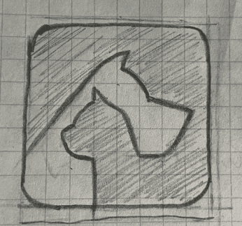


Pergato logo conceptual drafts.
Objective
Validate the logo’s readability, interpretability, and user associations.
Assess initial reactions and perceptions before revealing the concept.
Gather qualitative insights on the logo’s fit, aesthetics, and potential improvements.
Identify unexpected associations or misinterpretations.
Execution
Conducted 20 short interviews to validate the logo concept with two groups
In-house participants from the company who were not involved in the project.
Friends and acquaintances from the target audience (pet owners).
Structured the interviews into two parts:
Before revealing the concept - asked 3 questions to assess interpretability and observe initial reactions:
What is written here?
What do you see in the symbol?
What type of product or service do you think this represents?
After revealing the concept - asked follow-up questions to gather deeper insights:
How well does this logo fit the product?
What would you change?
How do you like it visually?
Output and conclusions
Readability: 100% of respondents identified the text correctly.
Associations:
Most participants associated the logo with an app for pets or their owners.
A few mentioned connections to a pet store, which aligns with the product’s long-term vision of adding e-commerce functionalities.
Aesthetics: respondents found the logo visually appealing, with no major recurring issues.
Innovation boost - Open discussions led to suggestions for app features and functionalities, providing valuable ideas for future development.
The qualitative method proved effective in gathering valuable feedback. This set the foundation for the next step—validating the logo through quantitative methods (e.g., surveys with a larger respondent pool).
Objective
Transitioned from qualitative to quantitative research to validate logo concepts on a larger scale.
Examined associations and perceptions related to the initially designed symbol.
Survey Design - The survey was structured into multiple sections, each focusing on a specific aspect of user perception:
User profiling – collected demographic data, including age, gender, and pet ownership.
Logo recognition – assessed respondents’ ability to recognize and interpret the symbol.
Feature relevance – gathered insights on user demand for key app functionalities.
Logo-product fit – evaluated how well the logo aligned with the app’s purpose.
Visual appeal – subjective opinions on the logo’s aesthetics.
Logo comparison – compared the main icon against 2 alternative designs.
Open-ended feedback – allowed to share additional thoughts and suggestions.
Execution - The survey was published among 🇵🇱 Polish users, in 2 phases:
Private contacts: Shared with via Messenger and distributed in-house within the company.
Duration: 2 days
Responses collected: 260+
Public audiences: Expanded to through Facebook groups and a personal LinkedIn profile, significantly increasing response rates.
Duration: 4 days
Responses collected: 480+
Results and Conclusions
Total response rate: 750+ responses within a few days
Additional insights: 188 extra responses for open-ended questions
General findings: Both surveys revealed consistent trends in user perception
Shape recognition
✅ No red flags detected in recognizing symbol or naming
✅ Most respondents associated the logo with a pet-related product or service
✅ Collected opinions indicated the logo fit the product’s profile well
Cultural insight
💡 Polish respondents reported no direct associations with the name "Pergato"
💡 Fun fact - an isolated respondent humorously identified the dog shape as resembling an "AXE," but this was deemed negligible, and no design changes were made.


Comparison of responses on logo recognition and subjective visual impressions.

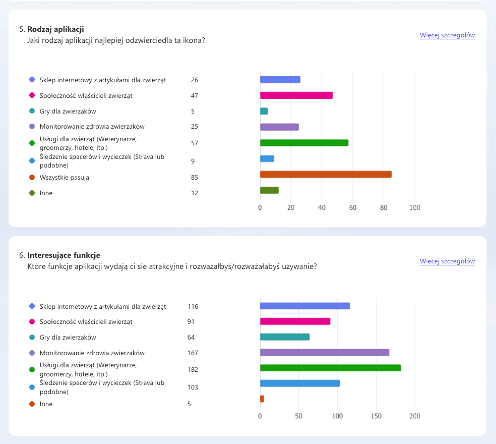
Analysis of answers related to app functionality and user expectations.
Logo Refinement - Finalized the approved logo with subtle adjustments
Used Adobe Illustrator to redesign curves and proportions with a circular grid for harmony and balance.
Polished the design at a micro-level to enhance precision, though changes were imperceptible to the average user.
Checked Accessibility WCAG.
Design System Update
Updated the logo component in Figma to reflect the refined version.
Assigned detailed tasks to front-end developers, including descriptions of all changes and new file attachments, to ensure smooth implementation across the app.
Assets Export - prepared an asset package to meet diverse needs:
Digital formats: Optimized for social media and online marketing.
App icons: Exported multiple variants for iOS and Android devices.
Vector formats: For high-quality print materials.
Created a Pergato Swatches.ai file with predefined color samples for consistent use across designs.

Process - Collaborated with the legal team to support the trademark registration process:
Provided required logo file variants in appropriate formats.
Assisted in selecting the relevant trademark classes.
Sent the logo for an audit to an external legal firm specializing in trademark registration and copyright law.
Outcome
⚠️ Received recommendations to modify the logo for compatibility with the initially selected classes.
Conducted an internal analysis
Determined that the logo did not require changes, like suggested.
Adjusted the registration process by excluding incorrectly chosen classes and narrowing the focus to Class 9 under the Nice Classification (software and applications for mobile and desktop use).
Successfully registered the logo in Class 9, resolving all associated risks.
Process
Conducted multiple workshops to iterate and finalize the brand vision.
Organized several pair-design sessions with the marketing manager to finalize the brand’s tone of voice and select archetypes (Jester and Everyman) for user communication.
Iterated color palettes and visual language guidelines multiple times to ensure they would serve as primary principles for the marketing team when designing campaigns and materials.
Used ChatGPT to assist in generating text content based on my descriptions, ensuring clarity and consistency.
Designed a Brand book including guidelines for visual communication.
Content of Brandbook (Version 0.1)
Brand Introduction
Vision: Defined the brand’s core purpose and mission.
Target Audience: Detailed description of the primary user group.
Values: Highlighted key principles: inspiring, joyful, and helpful.
Tone of Voice: Described the dual archetypes—engaging and playful Jester combined with the friendly and approachable Everyman.
Basic Styles
Brand colors: Basic and extended palettes, including main and neutral colors.
Preferred color pairings: Suggested combinations, schemes, and proportional usage.
Typography: Details about the main typeface and alternative fonts.
Logo
Concept description: Explained what the logo symbolizes and the origin of the brand name.
Variants: Provided descriptions of landscape, portrait lockup, and icon designs. Included definitions for clear space and minimum size requirements.
Color options: Full-color, flat-color, and achromatic variants.
Do-Nots: Illustrated improper uses of the logo to maintain consistency.
Visual Language Guidelines
Standards for interface icons, iconographics, and illustrations.
Guidelines for photos and videos, emphasizing style and usage.
Key-Visual - designed a single illustration to represent the core app concept:
Experimented with prompt engineering in generative AI (MidJourney) and incorporated a generated image of a smiling dog into the key-visual, enhancing the design.
Introduced the Happiness Bones system, where pets earn points of happiness for completing daily tasks related to play, health prevention, hygiene, and well-being.
App Marketplace Materials - prepared assets for distribution channels, including App Store and Google Play:
Designed 6 universal screenshots to illustrate the app’s key features
Delivered these materials in sizes optimized for various devices and resolutions in three languages for initial target markets: Polish, English, and Portuguese (Brazil).

Designed the very first version of the brand book created to address current needs but ready for further development based on evolving requirements or feedback.
Released an online PDF brand book accessible via the product’s website, ensuring easy access for collaborators.
Published an online branding assets package containing multiple logo variants in various formats for both digital and print use.
Adobe Illustrator color swatches as a brand book attachment, defining CMYK and RGB values for consistent color usage.
Key-visual illustrating the "Happiness Bones" concept:
Used initially for the launch campaign to explain the product concept.
Deployed across the landing page, app marketplaces, social media channels, and in-app onboarding screens.
Implemented App Store and Google Play materials:
Published seven finalized screenshots in various sizes optimized for iOS and Android.
Delivered in three languages: Polish, English, and Portuguese, catering to initial target markets.


Gained a deeper understanding of the trademark registration process, including the classification system, how to select appropriate classes, and the procedures involved in external audit consultations with legal agencies.
Leveraged generative AI (MidJourney) to create smiling, realistic animal visuals for the key-visual, saving time by avoiding the need to organize budgets for stock photo purchases.
Reinforced the importance of research through logo validation. An edge case where one respondent interpreted the dog shape as resembling an "axe" 🪓 highlighted the importance of testing designs with diverse audiences. This experience confirmed the value of including such research methods in future branding projects.
Lack of A/B experiment: A/B testing for App Store and Google Play materials was not performed, despite the platforms supporting this functionality.
Limited key-visual validation: The onboarding key-visual was only validated internally with the 15-person team, lacking broader user research. Due to time constraints, no detailed research was conducted to determine if users the key-visual’s communication was effective.


